My introduction to bibliography awakened a dormant mind that brought back memories of experiences and yet an unlearned knowledge about the world of bookmaking. The art of writing a book, a poem, a short story or even a Haiku has its beginning, it has a past, it has a history, and it has a soul. Most would think it starts with analyzing the text in the book but it is in the book itself that is the body and soul of text. The soul is the text but the body of the book is often overlooked and is not thought to be important. The soul of the passages may create ambitions, draw a tear, teach you life lessons and can be inspirational; but the body is the carrier, the deliverer. The vessel that carries the messages and holds the soul together. Put together by the unnamed, the invisible laborers; the ones that do not get credit for giving a text life.
During the entire class, as we learned about bookmaking, I kept experiencing déjà vu. I remember when I was a young girl and I was given books. Before I could read, I would look the book over. I would notice the edges on the book. Looking at the paper, perfectly aligned to the rest of the book. I would notice the cardboard front and back cover. Thicker than the pages. The spine of the book had a stripe that looked like fake gold with the name of the book going down the spine. The publisher’s name was written in scripted font. I examined the book as if I knew what it took to make it. Inside the illustrations were whimsical and the text in Times New Roman font, spaced out with a few sentences a page. At the time, at 3 years old, what was I looking for?
The paper, the text, and the font became more interesting to me when I became school age. I remember getting a new text book. I learned to smell the book, unwillingly, I was drawn to smell it. I could not help it. This brought me to learn about the library. Where the smell of paper of all ages, ink that was still fresh on the days newspaper and the students working on their homework. My father brought home comic books that someone gave him on his way home. My brother and I would read all of them on the weekends. DC and Marvel comics would come with a codex gathering with many folio sheets and stapled at the spine, but the Archie’s would come glued at the spine as if individually. The font in these comic books were some form of Times New Roman in balloons for the characters voices or in bubbles for inner dialogues.
I became interested in engraving watermarks when I discovered them quite by accident. I received a letter when I was a teen, on what I noticed was very good quality heavy paper and as I read the letter and noticed a design in the paper. It was not part of the text I was reading, it was not a picture of illustration; it was the watermark of the paper company in the background of the paper. When I turned the page over and turned it to the light I could see the logo and wondered how was that possible? Why didn’t all of my books have watermarks? The letterhead had the company’s name in intaglio print, filled in with gold ink. Their business card used relief printing with glossy black ink. All of this stirred my memory and my love for almost anything that is printed. Professor Moy taught us how it was done in our watermark session, answered so many questions, and revived my interest in the book-making process again and its extended elements. I am so thrilled to have been able to see The Center for Book Arts where we saw a machine that did the intaglio print for covers and I fantasized about how I want my books to look when they are printed or taking one of the books that I cherish and create a fancier cover for it. Intaglio printing on the cover and on the spine, filled in gold ink. Red leather bond cover. A factotum for every chapter each in a different color creating a rainbow of chapters and gold edging on the edges of the page. The limited edition would be bedazzled with a diamond on the dot of the “i” in my name and be displayed at the Grolier Club in New York City.
The printers: the setter and the inker, do not get credit as they place the tiles in the coffin and make sure there is no space in between. Place the paper on the tympan, pull the frisket down onto the coffin, slide the press stone under the platen and pull the till and the sheet has printed text. I visited The Center For Book Arts in Manhattan with some students and Professor Moy, where I saw a few printing presses. We were shown how The Vandercook was used and we were allowed to maneuver it. 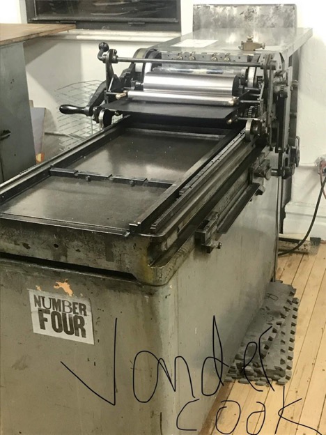 What joy! I remember seeing something like a Vandercook in an office in the public school I attended as a child. I remember the smell of the ink and carbon paper as I walked past the office on my way to class. After playing with the printing machine we all made our own little folio book with a stitching bond and a lovely cover. I was brought back again to fond memories of my childhood. As a child I would take notebook paper and fold it the paper to a common octavo fold, stapled the spine and used scissors to cut the edges and all the closed parts of the paper. I made my own little gathering of sheets, a small personal 3-inch booklet. I would doodle in the book. I was never taught how to do it before that visit to The Center for Books Arts. Once there, I felt like I had done everything that the center was all about; minus making paper from pulp (which I think I would enjoy doing).
I feel as if I may have been an invisible worker in my past life. Had I written a book and helped with the process? Had I been a child typesetter in a past life? This experience filled in the gaps of skipped knowledge in bibliography that I did not know, but still knew. Was my love of collecting books and wanting to have books a part of a past that my soul still yearned for? Or is it that the art of book-making is slowly dying and yet I want it to live, breathe, and be loved as much as all of us bibliophiles still do.

This entry is licensed under a Creative Commons Attribution-NonCommercial-ShareAlike 4.0 International license.


