By: Otasha James
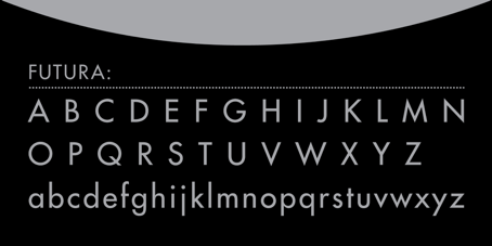
Futura is a font which started being sketched in 1924 and was released in 1927, at the Bauer Type Foundry. It is referred to as, “the fully developed prototype of the century Geometric Sans-serif .” Designed by Paul Renner, Futura was designed as a contribution on the new Frankfurt project. It is said that it was designed in competition with Ludwig and Mayer’s seminal Erbar typeface which was designed in 1926.
Renner’s approach in designing Futura did not take on most previous grotesques of sans-serif. Most previous sans-serif designs were based on models of sign-painting, condensed lettering and nineteenth-century serif typefaces, in favor of simple geometric forms. For example, there were near-perfect circles, triangles and squares. On the other hand, Renner’s design is based on strokes of near-even weight, which are low in contrast. The lowercase has tall ascenders, while the uppercase characters use proportions similar to those of Roman Capitals.
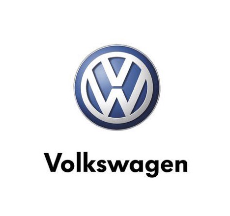
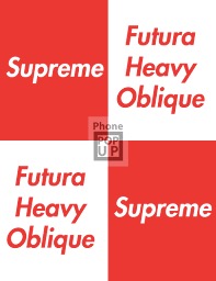
Futura was heavily marketed by Bauer and its American branch, “die schrift unserer zeit” (which is German for “the typeface of our time”) and “the typeface of today and tomorrow” in English. It has maintained its popularity and is used in famous logos such as Volkswagen, Supreme, IKEA and Party City.
![]()

Works Cited
- Lekach, M., 2020. 8 Famous Fonts And Designers Who Made Them – 99Designs. 99designs. https://99designs.com/blog/creative-inspiration/8-famous-fonts-and-designers-who-made-them/.
- Font Family Page. (2020). Retrieved 19 May 2020, from https://www.myfonts.com/fonts/bitstream/futura/
- Rethinking IKEA Logo — SONI HAHN. (2015). Retrieved 19 May 2020, from http://www.sonihahn.com/ikea-logo

This entry is licensed under a Creative Commons Attribution-NonCommercial-ShareAlike 4.0 International license.