Of our endeavors at the Rare Book School, encountering the printing press was one of the most memorable and defining moments. Located in a room of its own, the printing press was one huge artifact surrounded by the many tools and components required to make it operable. While the printing press did look quite crude, it was a great reminder of how far we have come in terms of technology for the printing of books. Even in the era of the printing press, where books drastically became more available to all people, the process required to set up the printing press for printing was quite tedious.
Lecturers, Barbara Heritage and Ruth Ellen St. Onge taught that in order to set up the printing press for printing, the letters that would be printed would first have to be established as the form of printing was hot metal typesetting. In hot metal typesetting, an alloy of molten metals and other elements including antimony, tin, and lead would be used to make the letters. Once the molten alloy was placed in a mold called a matrix and the mold of the letter chosen was pressed into the mixture, the slug formed was left to cool. As most metals are solid at room temperature, the shape hardened into a solid.
Lead is a metal that is very soft and malleable in comparison to other metals. Due to this, the shapes it produces are too soft for printing by itself. Hence, it needs to be in an alloy with other metals. Tin is a metal that makes the type metal much tougher and gives it more resistance to being worn down. This is a very useful quality for type metals to have, as the type may be used numerous times depending on how much needs to be printed. However, antimony is a metalloid and one of the properties of metalloids is that they are brittle. By having antimony mixed with the other metals, it becomes much easier to break off the excess parts of what would then become the letter.
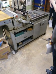
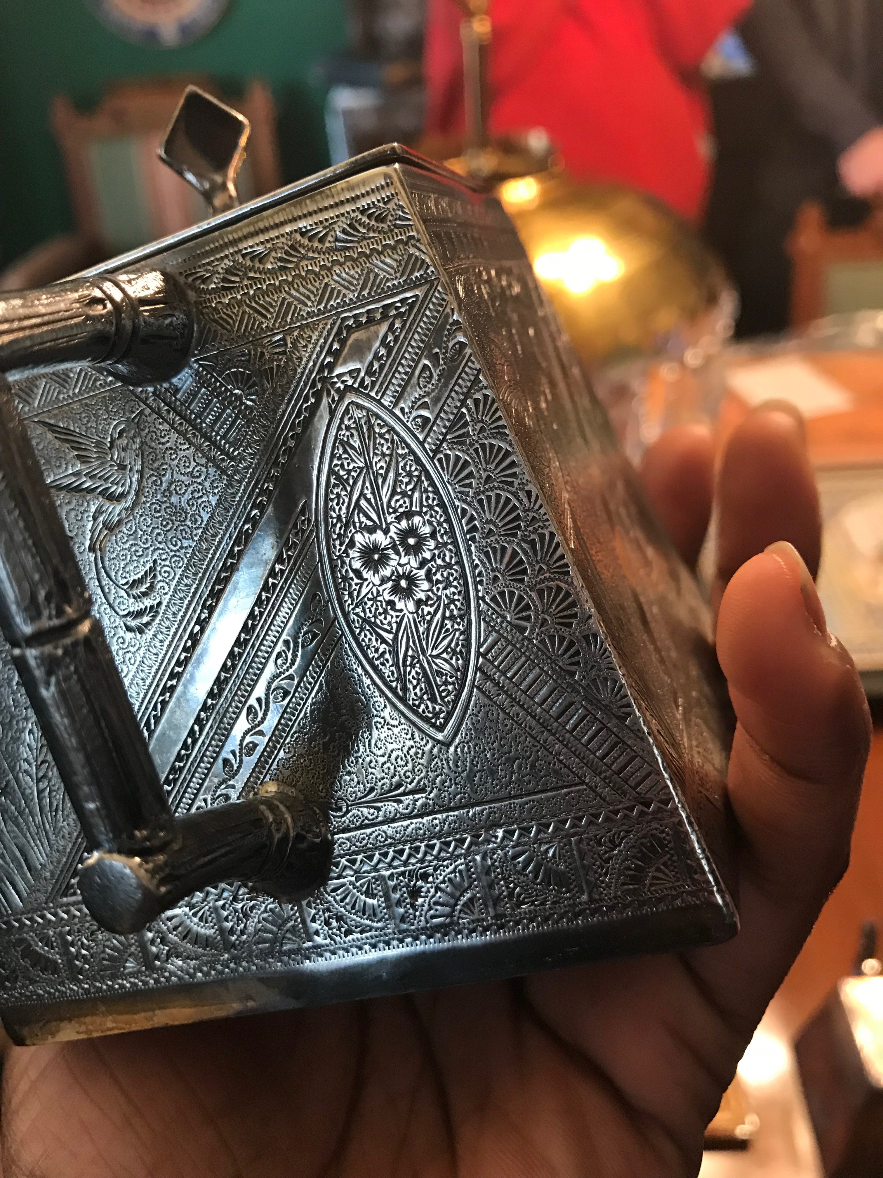
A photograph of the printing press we saw at the Rare Book School can be seen. It certainly has some wear to it brought upon by age despite being kept in good condition. It still isn’t so dated though, as its structure is very picturesque of the industrial era. In the top right, many thin drawers can be seen. These are known as the type cases and within them, the movable types formed for the purpose of operating this printing press are stored.
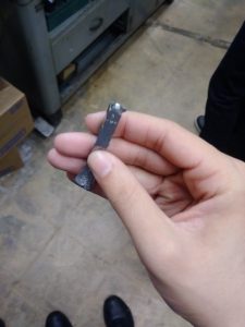
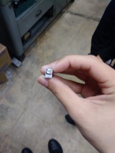
In the picture depicted, it can be seen what the metal type looks like from the side when it hardens. A substantial amount of the slug is broken off as the only part of it needed is the part with the letter on it for printing. In the other picture, an overhead view of the object shows the letter as it would be used for printing. This is only an individual letter. In a linotype machine, a slug is made of a line of text to allow for more efficient printing.
Seen here, there is only one letter and it is in one specific font and size. This means that this must be done for every letter that is desired to be printed, which is usually every letter in the alphabet. In addition, every time the font or size needs to be changed, a different set of letters must be made in that font or size. Once it was determined a set of letters no longer needed to be used, it would be melted back down into an alloy and recycled for future use of printing. This is what was meant by the word tedious, but it was still progress. The Ludlow typograph is a type of linotype machine which uses fonts such as Optima, a type of sans-serif. The sizes of the fonts for letters and numbers could be 12, 18, 36, or many other sizes.
One way this printing press is more intimate than our modern printers is that its compartments and components can be seen and understood. Modern printers are far more convenient but it is much more difficult to differentiate what its individual pieces do. As a result, it is not as visual and cannot be appreciated as much by those who like to see the process of it.
The evolution of typography is quite apparent just from the pictures shown. Hot metal typesetting came into prevalence in the 1880s. It remained relevant until the mid-20th century. Other forms of printing, such as phototypesetting and then the many forms of computer printing outdated as well as were more efficient than hot metal typesetting. No longer were the machines so ponderous and the components so rugged in appearance. However, it is thanks to the Rare Book School that I was able to learn about and appreciate them.
Works Cited:
Narewska, Elli. “The End of Hot Metal Printing: GNM Archive Teaching Resource.” The Guardian. Last modified February 5, 2018. https://www.theguardian.com/gnmeducationcentre/2015/mar/03/end-of-hot-metal-printing-gnm-archive-teaching-resource.
Kupferschmid, Indra. “Cold Type Vs. Hot Typesetters.” Alphabettes. Last modified July 19, 2017. http://www.alphabettes.org/cold-type-vs-hot-typesetters/.
Thorwaldson, Jay. “Printer’s Jargon: Hot Type.” The Museum of American Heritage. Last modified September 30, 2011. http://www.moah.org/virtual/printing2.html.
“Optima Font.” Download Free Fonts – Search Free Fonts. Accessed May 18, 2018. https://www.searchfreefonts.com/font/optima.htm.
“Antimony, Chemical Element – Reaction, Water, Uses, Elements, Metal, Number, Name, Symbol.” Chemistry Explained. Accessed May 18, 2018. http://www.chemistryexplained.com/elements/A-C/Antimony.html.
“Lead Properties.” The Periodic Table. Accessed May 18, 2018. http://www.elementalmatter.info/lead-properties.htm.
“Tin (Sn) – Chemical Properties, Health and Environmental Effects.” Water Treatment and Purification – Lenntech. Accessed May 18, 2018. https://www.lenntech.com/periodic/elements/sn.htm.